
Company
Year
My role
Prototype
Platform
Overview
About Lili
Problems
Although our mobile app offers all the necessary features just a tap away, our users needed a more convenient way to access and analyze their financial information in depth.
Mobile is too small, sometimes
use-cases.
Competitor alignment
our direct competitors.
Not having a web platform resulted in losing potential customers.
Opportunity
Expanding the universe our platform and making it easier for our customers to access, manage and analyze their financial information in depth.
My perspective
My primary goal was to ensure a consistent experience between mobile and web app.
It was crucial to me that they would feel comfortable in the new web app. In order to achieve this, I had to carefully evaluate which features from the mobile app were not necessary for the web app, and which features needed to be adapted to better suit the web app.
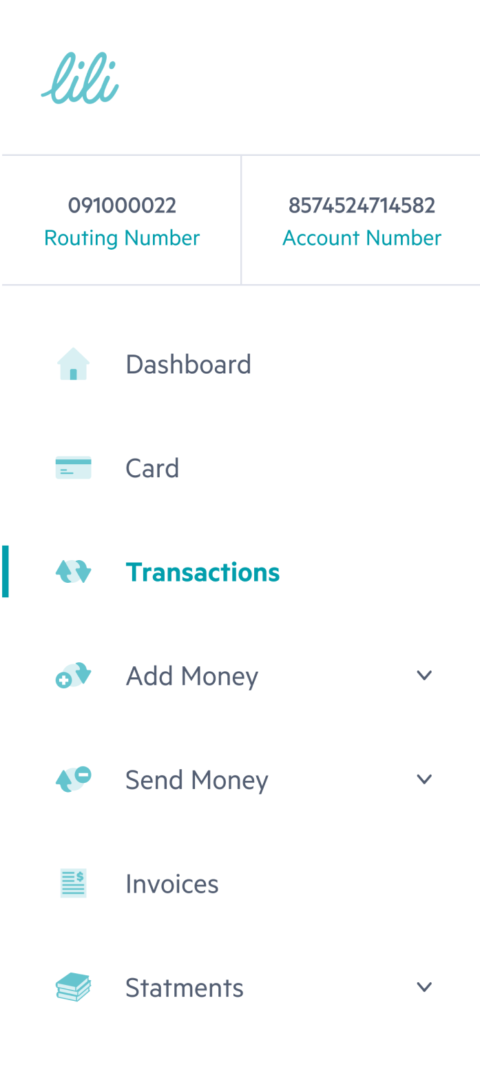
The final design
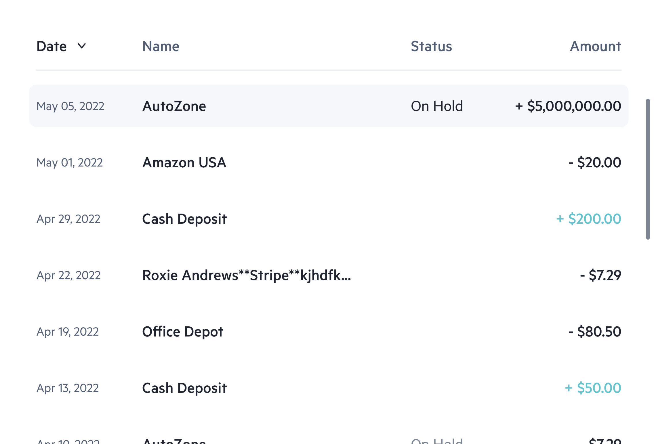
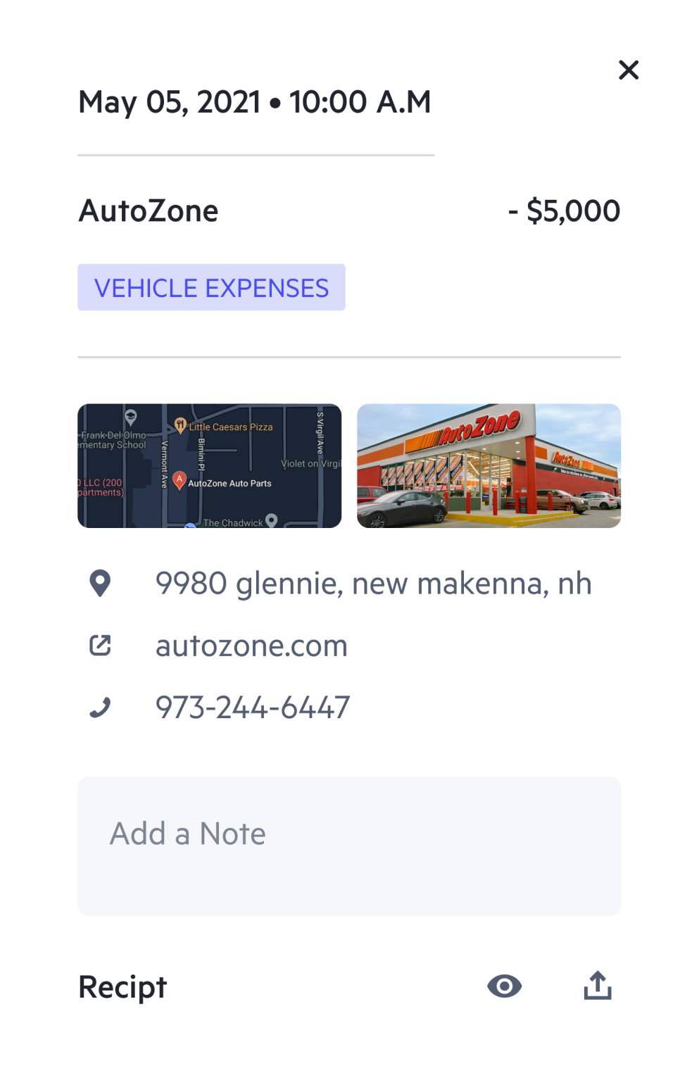
Transactions
The main transactions screen, allows users to view all their transactions with detailed information.
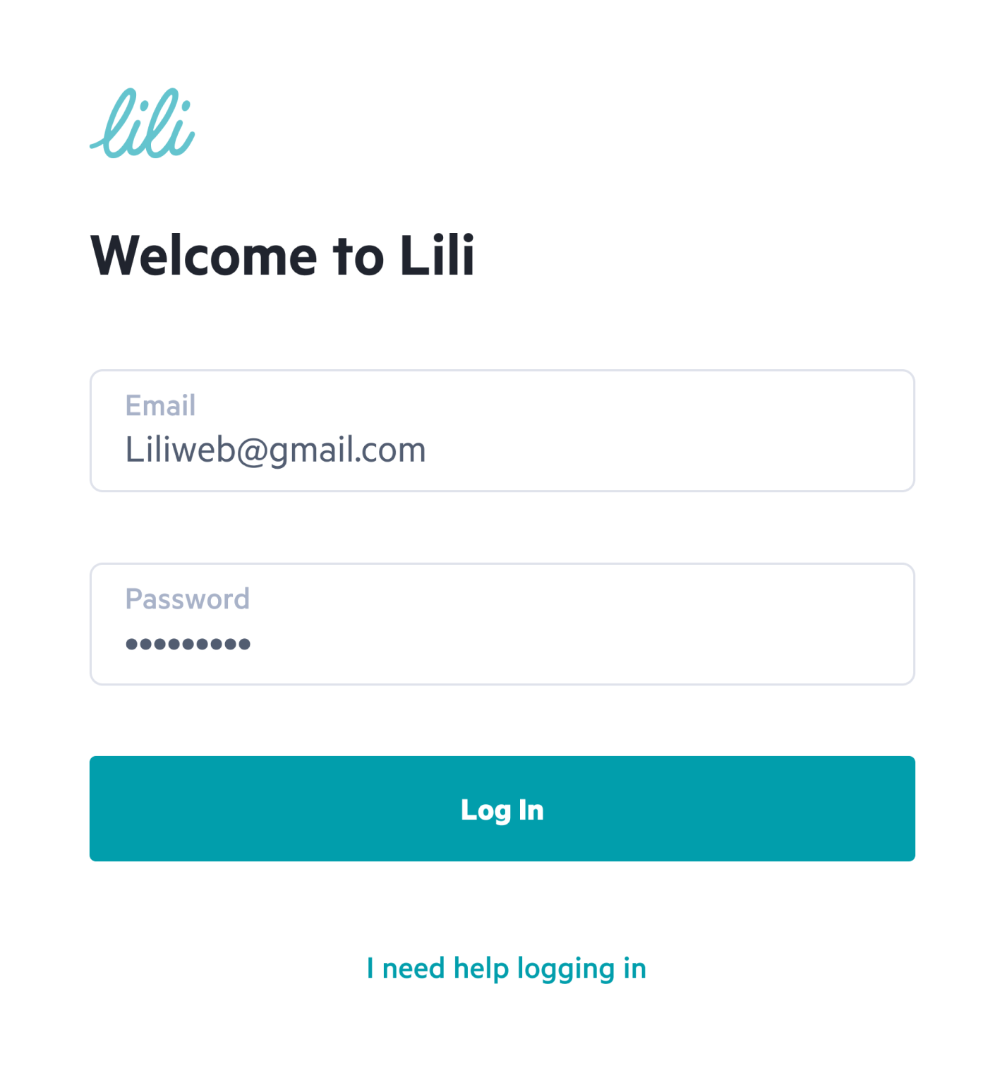
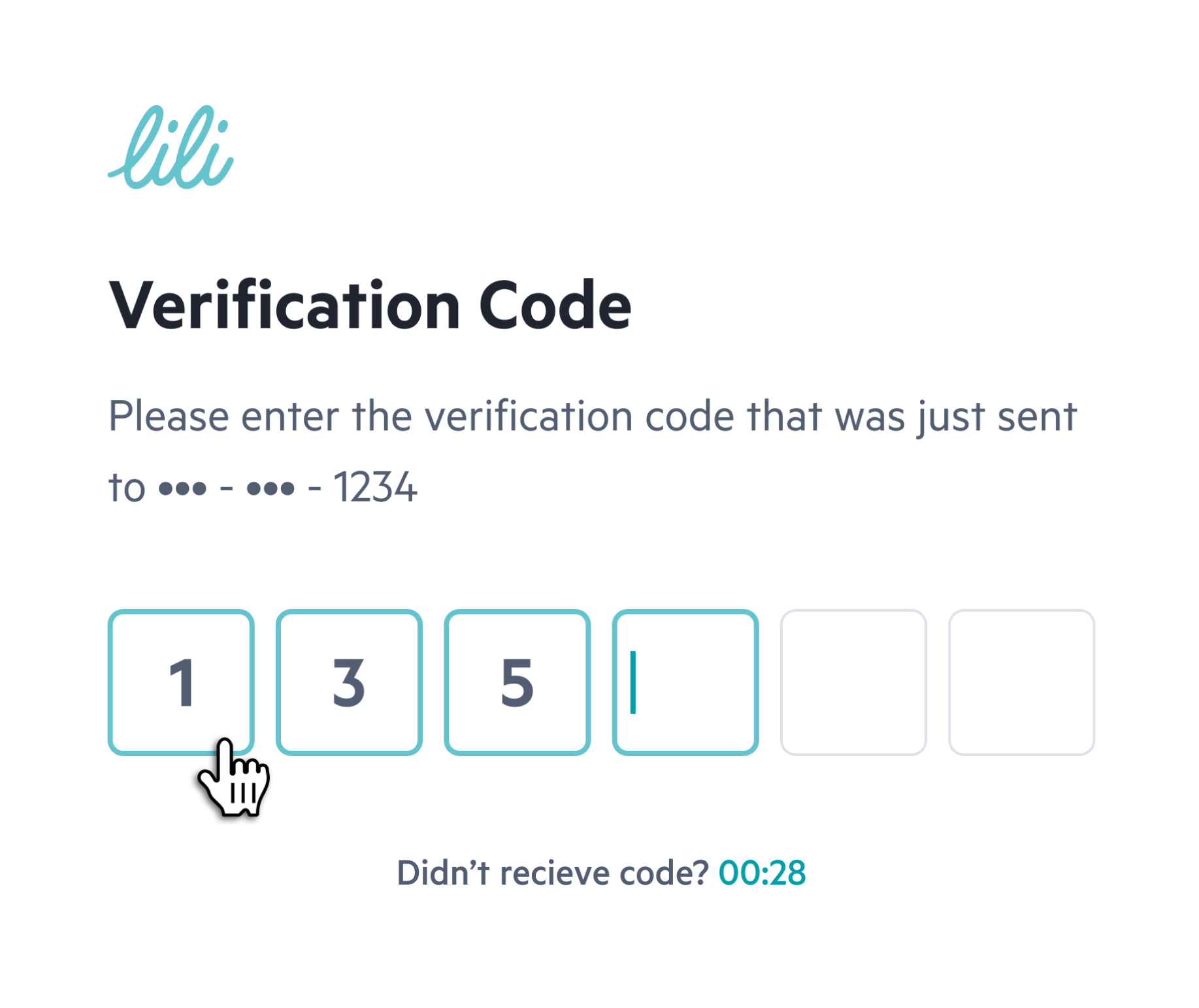
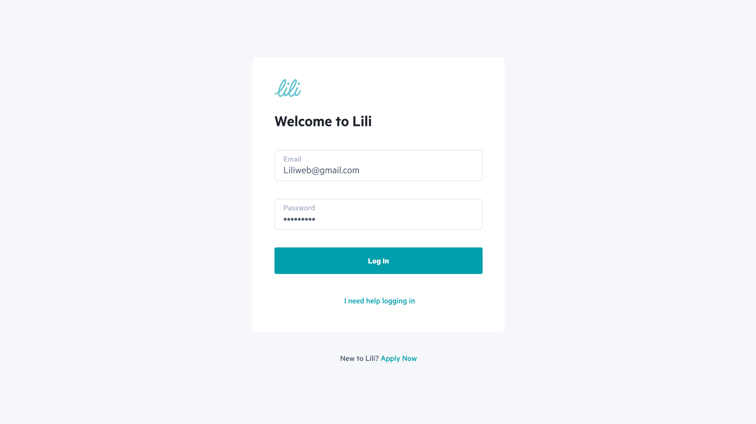
Login
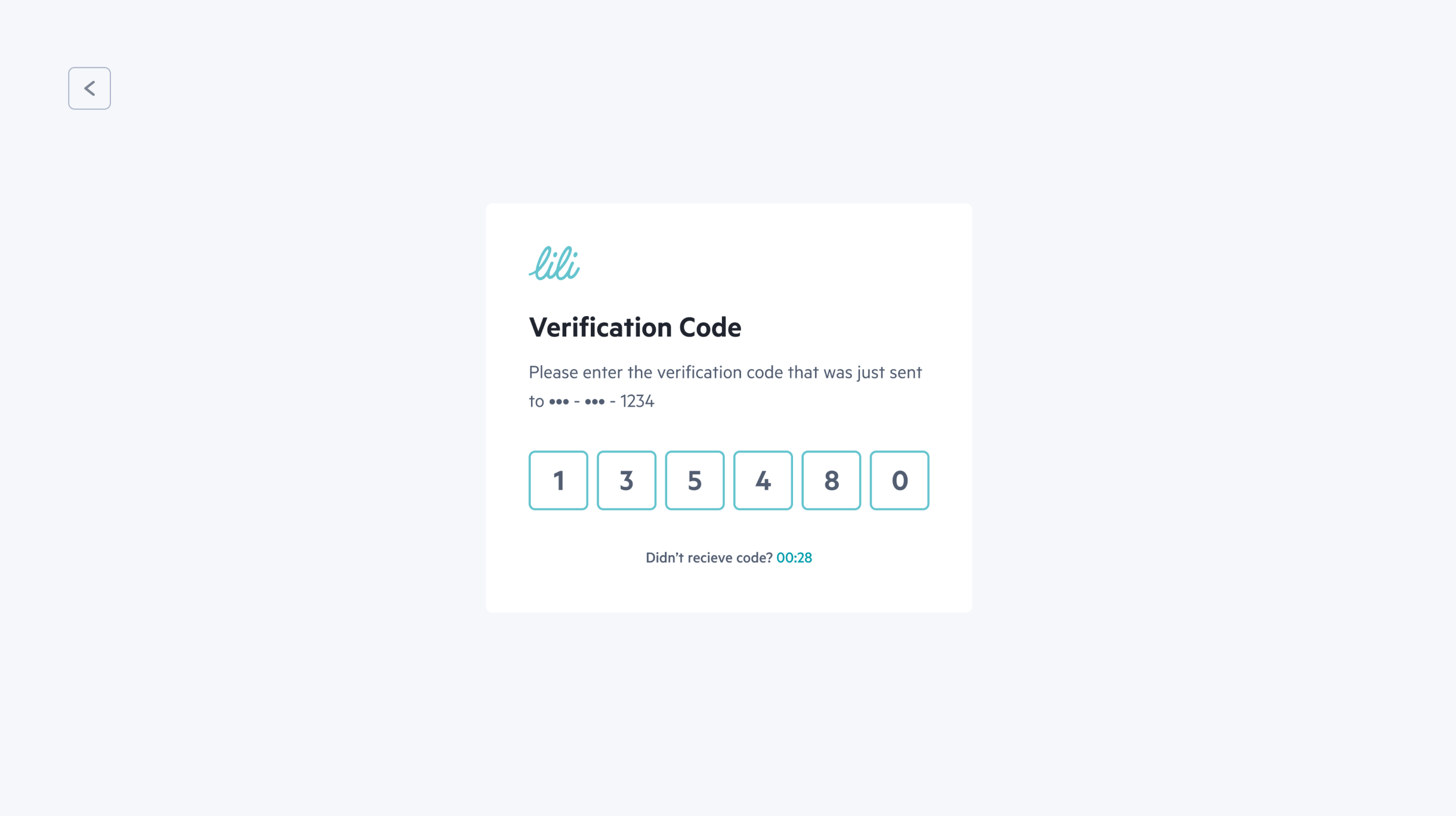
Verification Code
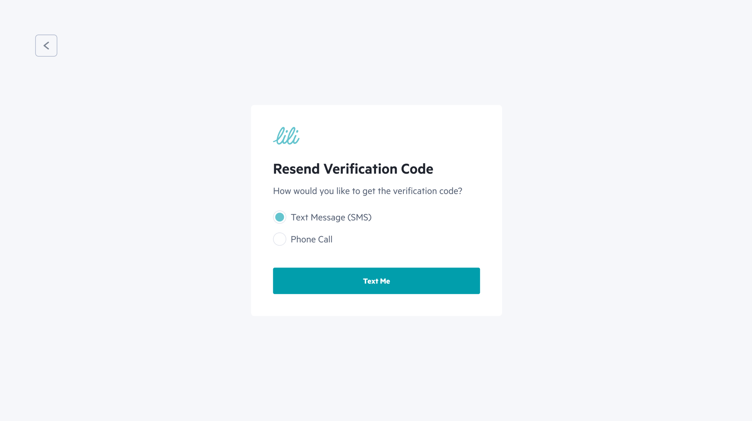
Resend verification Code
Menu on hover for smaller screens
It can be accessed by hovering over the designated area.
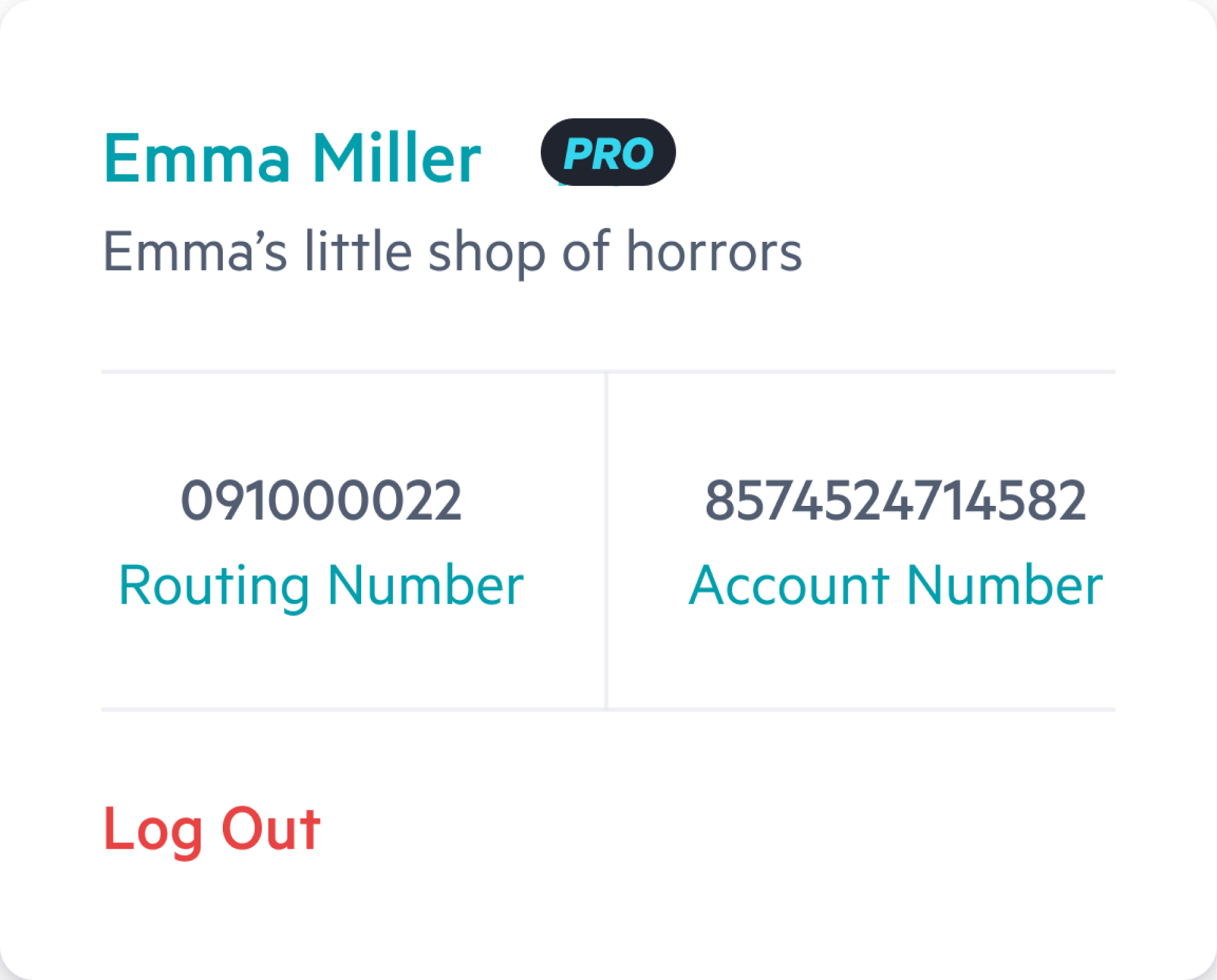
Personal User Menu
This menu provides an easy and convenient way for users to access and manage their account information.
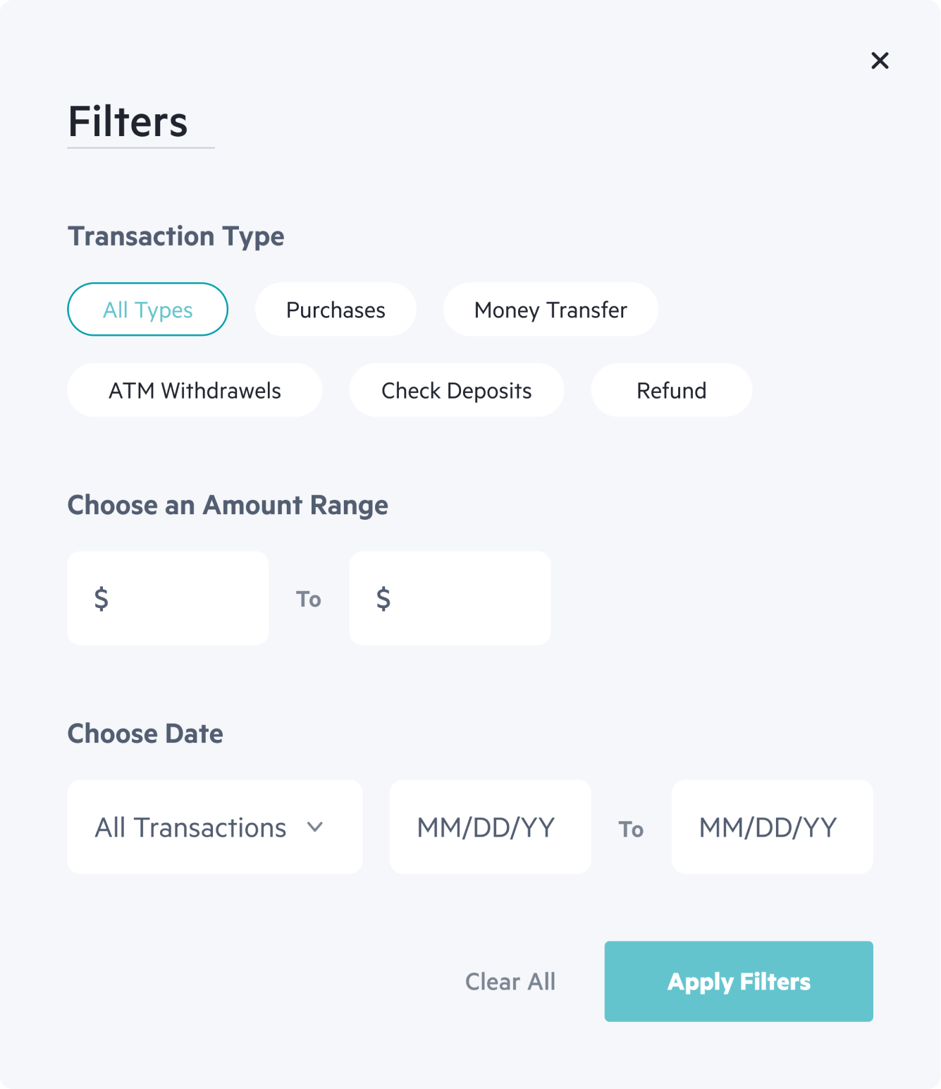
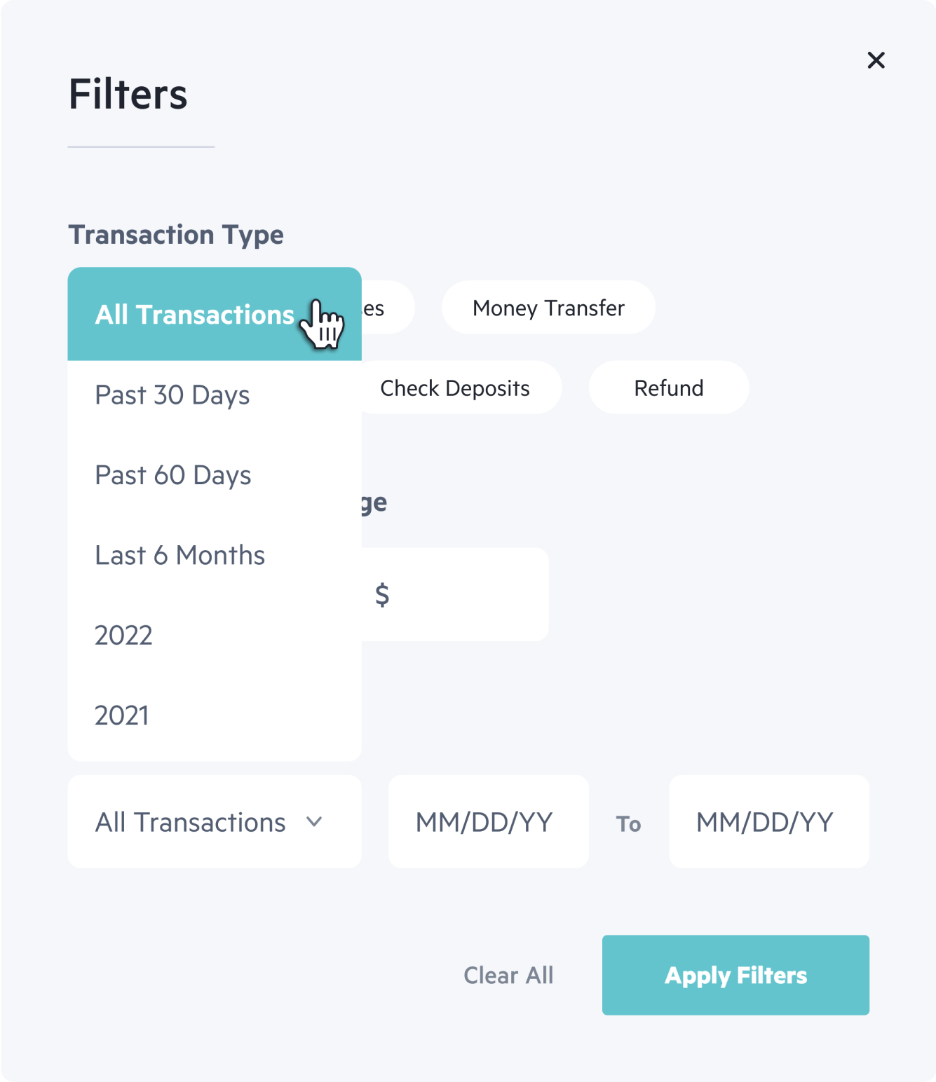
Transactions Filters
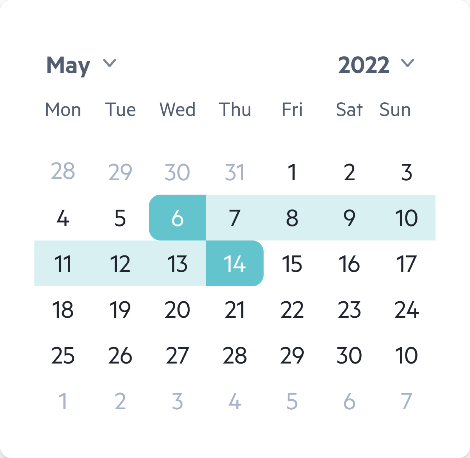
Transactions - Calendar Filter
Next Steps
After the launch, we wanted to make sure that the web app is working properly and that our users are enjoying using it so I planned:
1. User interviews with our beta group (±100 users)
2. Set up an Amplitude dashboard with key UX metrics